Setting Trends With Maps
Table of contents:
Maps are not just the big pictures in the hands of surveyors or sailors or tourists anymore. They are now a tool for information exchange. Unlike a decade ago now you can see maps everywhere. Maps have come out of the school textbooks and administrative documents to the fingertips of every individual. This democratisation of maps is the result of the advancement in technology and medium. The Internet and smartphones are the major factors that turned the entire concepts in the industry. All the print and digital media along with social media accelerated the change. When the cost of producing contents became lesser the number of contents produced escalated. Data bombarded into the screens in the forms of text, image, tables and videos. Data pumped continuously to the users, whereas the time remained the same. The visibility of these data started questioning by the authorities. As a solution, large data were formulated and summarise into tables and were presented. There is no limit to improvisation and innovation, soon a new method of data representation was brought out – Infographics. A picture speaks louder than hundred words – True! Infographics found great acceptance. The fear of long rows and columns ended up in infographics. As time progresses the time spent by an individual on a single piece of content on the digital media became lesser and lesser. It’s just seconds or a fraction of seconds between their scrolls. Thus maps also became part of these infographics and started more and more acceptance. Every data with a spatial connection seems to have a representation in maps these days.
In this post, I would like to point out how I (my works) could influence the community and people to change their thinkings and set the trend of bringing the data spatially. When data came in maps it became extremely easy for people to visualise, thus the effect was great.
1. OpenStreetMap Mapping party collaborating with the local administrative body
This is the most impactful project I have been part of to date. Koorachundu Mapping Exercise V1 and V2 happened in July 2014 and December 2018 respectively was an eye-opener for many government organisations on effective mapping of the resources at the minimum expense. The power of open data and participatory mapping was proven with this projects. The Kerala state government and various local bodies later adopted the methodology. Now there is a government-sponsored programme statewide for mapping using the same strategy.
2. Election Results with interactive dashboard
In 2014 where interactive infographics was not that popular in Kerala. The digital portals of newspapers had sort of static infographics. Elections are the only time we see map-based infographics and that to a static thematic map. I worked with the Geominds team in developing interactive infographics of the Kozhikode district at the Panchayath level. We also tried to add more information such as the fund allocation in various sectors, the demographics and past election details of the 2010 and 2005 LSGI elections. We web scraped data from various sources, weeks of manual work and aggregated all and build a dashboard (have a look at it) rather than any infographics with much information. Thus a map-based interactive dashboard was born that too completely with Open Source platform and tools.
A snippet of the LSGI election Dashboard made by team Geominds.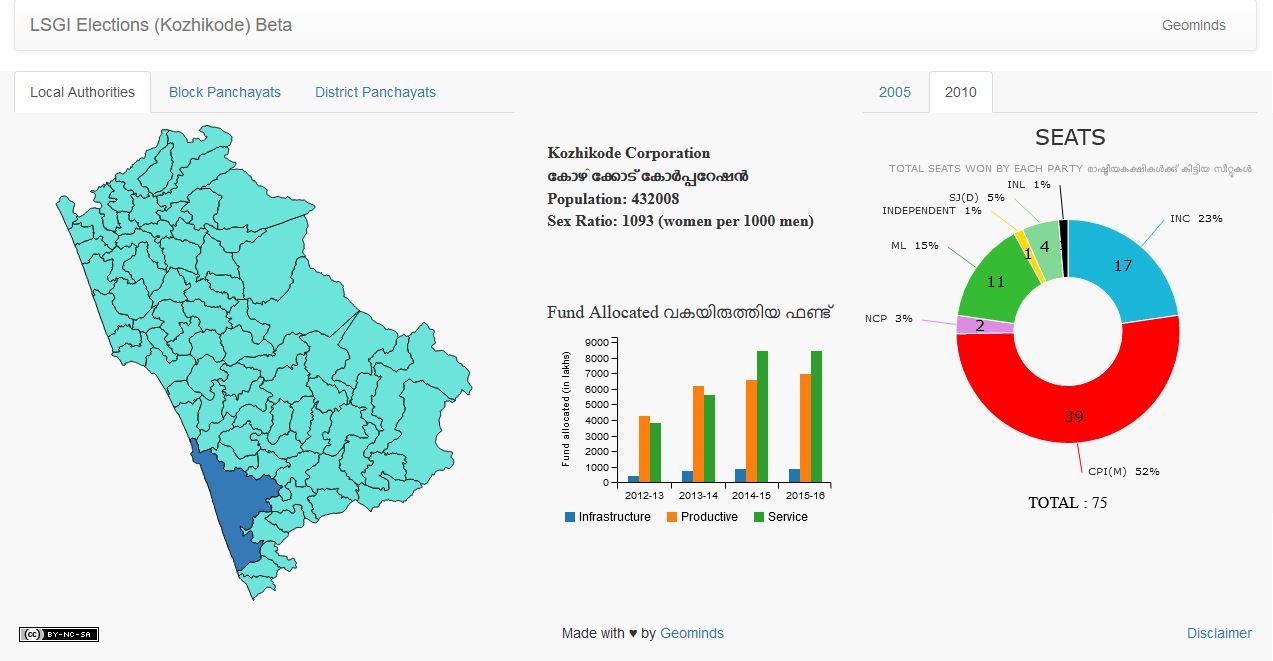
3. IMD warning into Maps
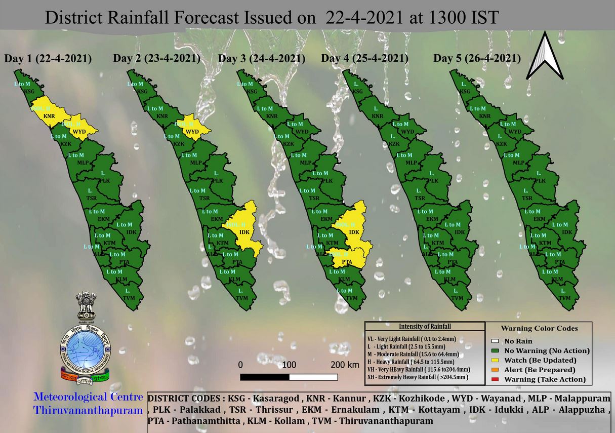
Kerala was washed away by a catastrophic flood in August 2018 (known as the 2018 Kerala Floods) and till then people were not giving importance to the warnings or were interested in the weather warnings. It was the first time for many that they were hearing the different colour-coded alters like ‘Red Alert’, ‘Orange Alert’ or ‘Yellow Alert’. The State Disaster Management Authority was an unknown department for common people. The Indian Meteorological Department (IMD) circulated the warnings through every possible media. The format of such warnings was in tabular form.
A warning IMD realised during 2019 Kerala floods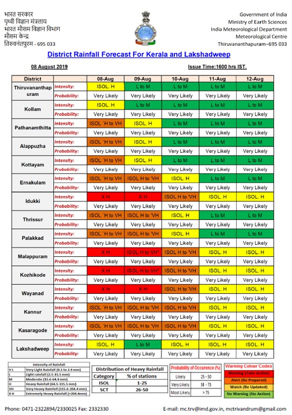
2019 was no way different in Kerala, though the intensity was less, a large population was affected by the floods. Kerala State Disaster Management Authority (KSDMA) also started circulating warning and alerts in the same formats. With long tables and terminologies like High to Low, Low to Very low etc. created less impact on people using or circulating. To simplify and make the people understand the alerts, I decided to summarise those into the maps. As IMD puts releases the newsletter on the alerts (3- 4 times a day) I summarised that information and prepared maps and circulated it through my social media handle and the WhatsApp groups and status.
A warning map I prepared summarising IMD report during 2019 floods. 3 such post was created per day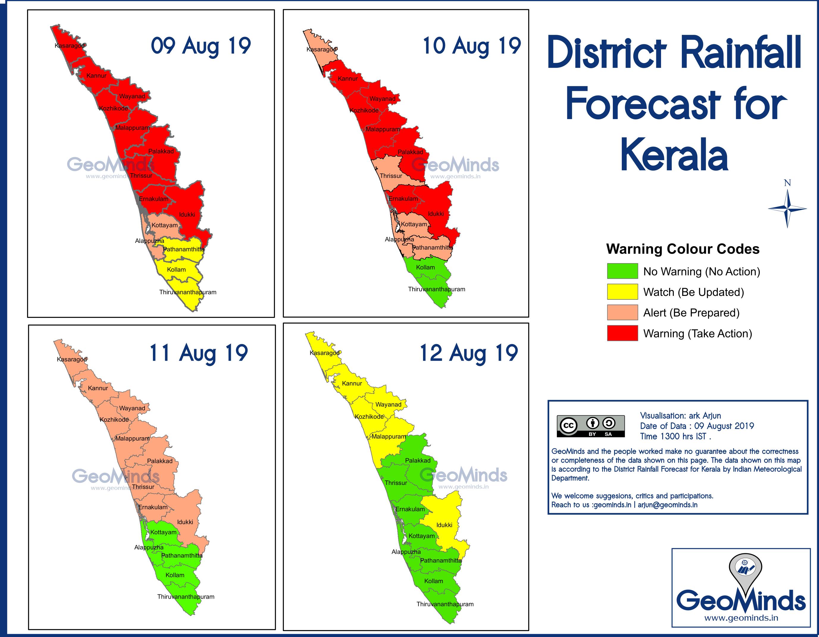
Even I didn’t know that my maps had this popularity until I got the same map forwarded to me and my contacts and connections started asking me for the next map update post. As a creator that was an overwhelming feeling for me. Some of my connections forwarded it to the authorities as well.
Soon towards the end of the 2019 floods, KSDMA started preparing similar maps. Seeing this I felt like my efforts were right and here is the proof. The goal has achieved and now I can be happy. Since there is no point in creating redundant data, I stopped creating seeing the consistent updates from KSDMA. Also, those posts will have more visibility and authenticity than mine, though both are holding the same information.
One of the warning map post during 2019 floods by KSDMA IMD started preparing simple maps like this since late 2020.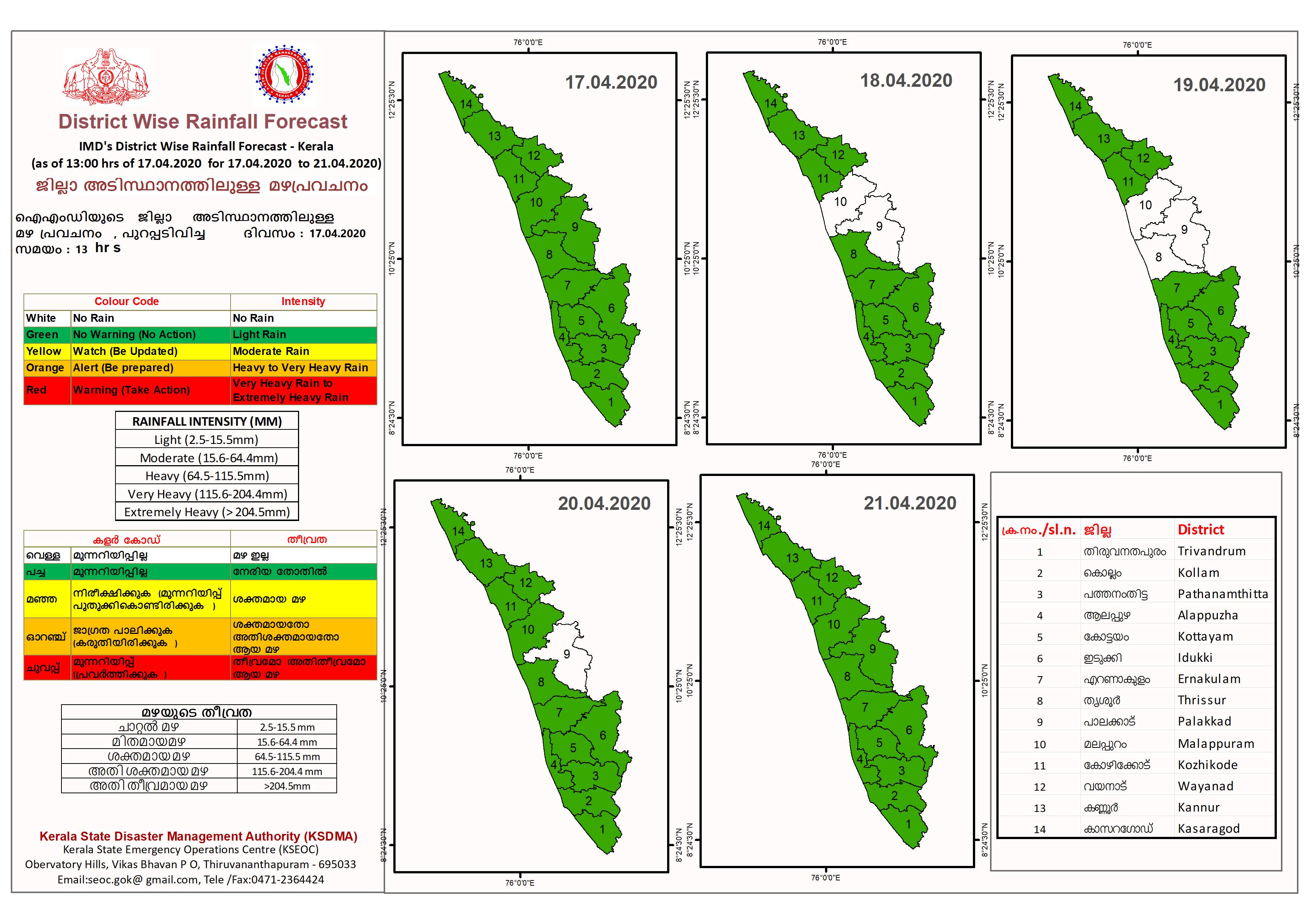
4. Cyclones and animation images
Today there are lot of weather forecast and visualization portals available such as windy, Earth Nullschool, Zoom Earth etc. At the time of cyclones now people started checking these portals and I have seen a lot of people posting animation images of the wind movement. This trend started in very recent time. People started to understand the science of the wind movement or at least the pattern of those movements and say here we have cyclones.
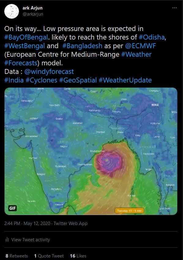
My tweet before Cyclone Amphan creating a gif image of screenshots from windy.com. The tweet was liked by the official windy handle and I saw new such tweets from their side from the next cyclone
5. COVID-19 and Maps
In the first wave of Covid-19, I could see a large number of dashboards being published with the state level number of cases, national level and international level. There were only change of colours and style rest everything was the same. The creators don’t take the pain to update those dashboards frequently or never it was. It may be due to the lack of data reliable availability from respective sources, or some just needed to show off that they could also create a dashboard. Very few among those dashboards (apart from govt) consistently took it forward some of them made available those data curated by them as open data (hugs to them). Portal like https://www.covid19india.org/ and https://covid19kerala.info/ (there may be many but these are the ones I came across) improved the data quality, visualisation etc. day today.
I worked with Open Data Kerala team to prepare the map of COVID-19 testing laboratories approved by the Government of Kerala. The name, type of test and address of the laboratories was available at a horrible pdf on the DHS website. We cleaned the data and geocoded the location of the laboratories and a web map was published. Also, the geocoded data was made released through Open Data Kerala as open data. This is not just the data of Covid-19 laboratories, it can be used as the location of 626 laboratories in the state hereafter.
Visualisation on the dataset using here studio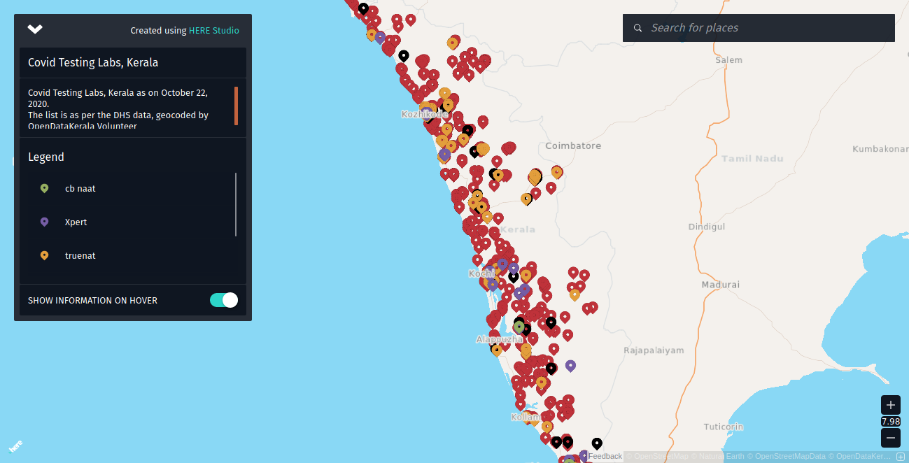
Weeks after the vaccination started, the Bhuvan Geo-portal started proving the location of vaccine centres in the country. Soon with the availability of those data to others, it became available in every other portal and maps. Recently the CoWIN platform has gone geospatial with the facility to search the vaccination centres on map.
Vaccination centres visualised in Bhuvan portal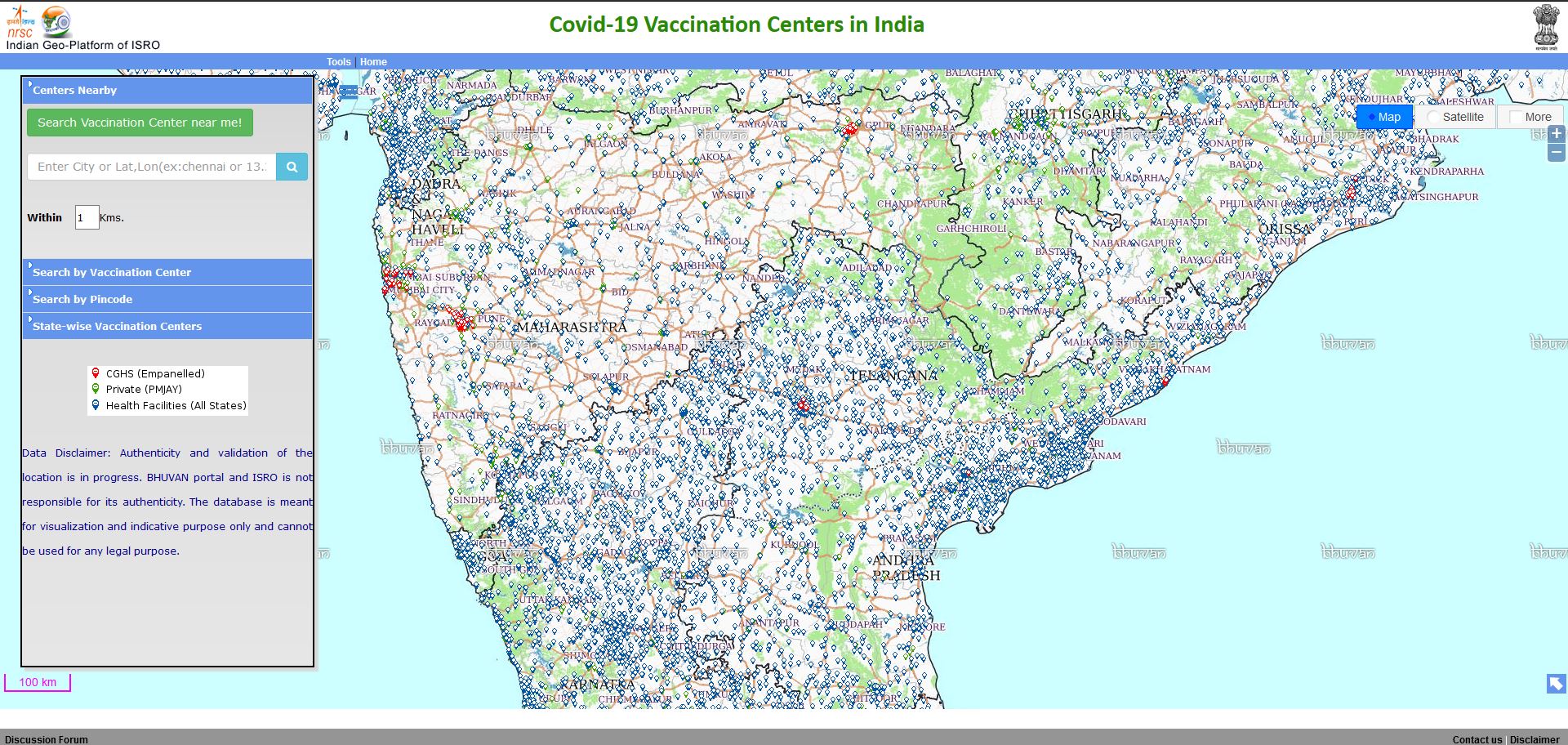
When the cases are increasing and the dynamicity of the epidemic is changing the strategy for fighting back has also been to change, so has the level of study on it. Studies and control measures are done based on data. When the data controlling measures are at the micro level the data available are still at the macro-level (at least to the public). The district collector of Kozhikode, Kerala has started publishing the data of Test Positivity Rate (the percentage of people testing positive on the day with respect to the total number of tests done on the day) at the local body level. Kerala has already started micro containment zones and all for the control measures to impart. This minute level of data helps in various aspects of controlling the epidemic including aweraness among citizens. But the data published was in the tabular form (as an image) with a weekly average(7-day average) for the past seven weeks. Which was again hardly conveying the seriousness to the people while they scroll. I manually digitized 546 values (78 local bodies 7 weeks each) of TPR and joined it with maps. I tried different visualisations using the flourish. An extruded 3D map of local bodies of Kozhikode indicating the latest TPR, an animated chart of the progress of each village during these 7 weeks in the TPR, and an animated chart of top villages in the district during these 7 weeks in the TPR.
Screenshots of tweets of the three visualisations done on 16th May 2021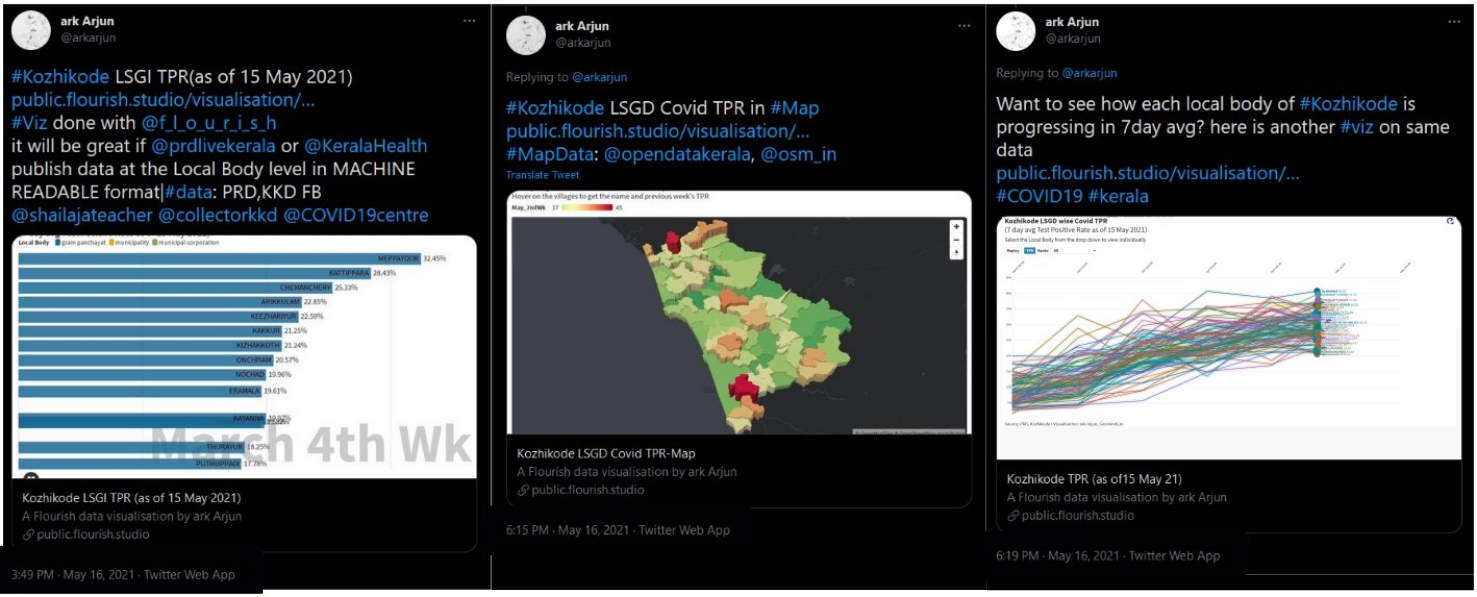
I am glad that it reached the authorities and they had put their efforts to build a similar graph and TPR map that night itself and shared it through the district collectors official social media handles. From the next week onwards they have realised the importance of visualisation in the information exchange and thereby in awareness.
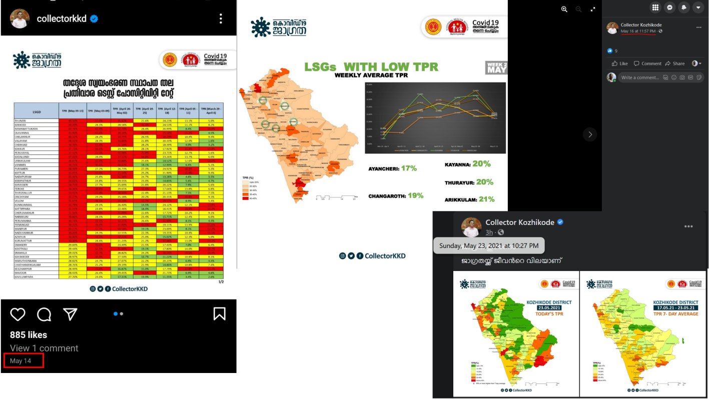
The posts of District Collector Kozhikode. (from left) Panchayath wise TPR in tabular format on 14th May 2021. Panchayath wise TRP map and graph published on 11:57 PM 16th May 2021. Panchayath wise TRP map of the new week and previous week published on 23rd May 2021
The real influence of this visualisation was felt when I got queries from many people asking do I have the data on their district, some needed for the entire state and some needed at the India level. Some even asked for vaccination data at the village level. So I request all the authorities and local bodies to publish the data in the machine-readable format at the maximum minute level they could ward level or panchayath level in the open license.
Any Comments on the article? Let me know @arkarjun.