Maps Are Always Wrong
Table of contents:
In this article I have tried to explain the concepts of maps and map projections with minimum technicalities even for a non technical reader to understand.
License: This article is licensed under the Creative Commons Attribution-ShareAlike 4.0 International (CC BY-SA 4.0) license.
Yes, you read it right. Maps are always wrong! Surprised? I can explain.
Let me start with a small question. “What is the shape of the earth ?” Of course not flat, round - No! spherical? - No! Ellipsoid- No! A geographer out from the readers is shouting “Geoid” - No not a geoid as well. Well, then the teachers and scientists were actually fooling you all these years? First of all, understand that the earth has no regular shape. We consider it as a spherical or a geoid for the ease of many purposes. The actual earth may look like something in the figure below (vertically exaggerated).
Earth’s geoid undulation visualised by ICGEM.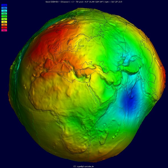
The branch of science for measuring and understanding the geometry, shape, orientation and gravitational field of the earth is known as Geodesy. A lot of approximations are made in the figure of the earth to bring out satisfactory results in many geodetic calculations. The figure of earth is a jargon in the geodesy, that refers to the size and shape used to model earth. As we do approximations in geodesy let us consider earth as a sphere for now, and agree that a globe represents our earth.
A globe has its own disadvantages. With its size and amount of information it can hold, globes that are always less preferred. So how do we transform a globe or transfer the information in a globe to solve these issues? Simple replicated it over a flat surface! This flat replica is the map. But It isn’t that simple a process as said. There should be certain laws and procedures for this process of replication which we call it as projections systems.
The Orange Problem
Many might have a thought why the transformation of the globe onto a map isn’t easy. This can be explained with an orange. The activity is to take an orange and peel it. Wait, the peel should be a single piece. Now try to flatten that single piece of orange peel on a flat table top. That orange peel is the earth surface. Now you might have understood why it is difficult. Like it is impossible to flatten an orange peel without tearing or deforming, it is impossible to drape the earth surface on a flat surface to prepare maps.
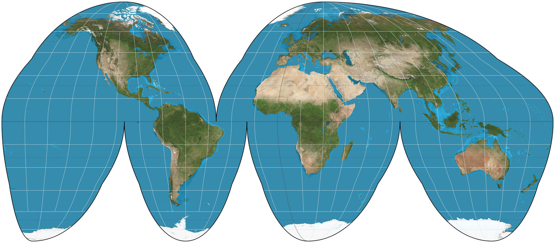
Goode homolosine projection. | Image:Strebe
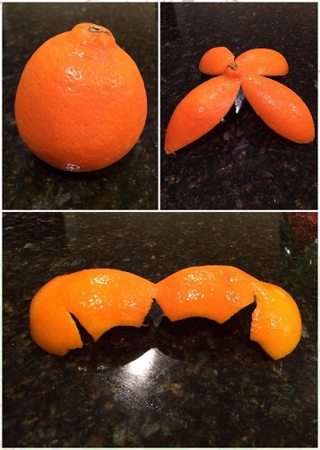
Image: Rhuerta
Either Shape or Area or Distance or Direction or in combination of these are distorted for every map. Now do you agree with me on the title? No? You still need proof?
Let us look at the world map in the mercator projection, which is widely used. This became popular as navigators preferred it due to the preservation of its shape and direction. Look at the actual size of the countries and their size on the mercator map in the below visualisation.
The visualisation created by Climate data scientist Neil Kaye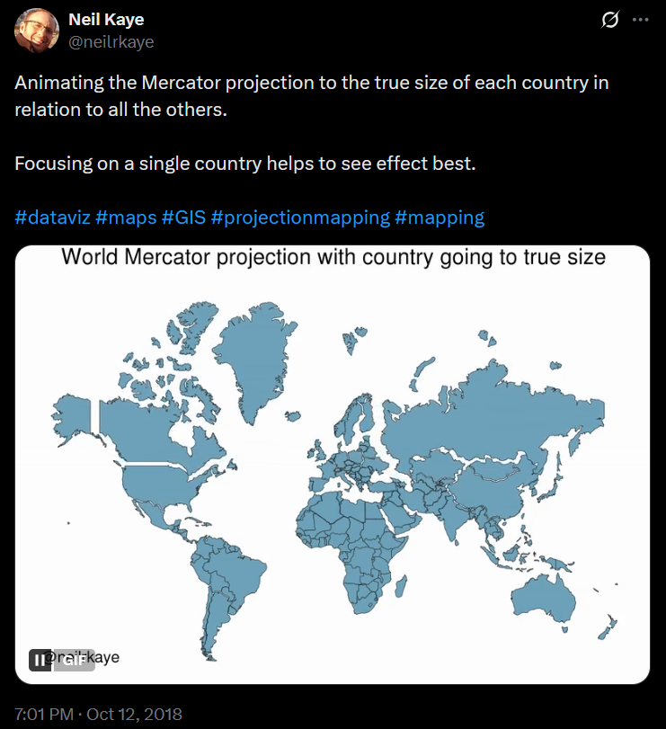
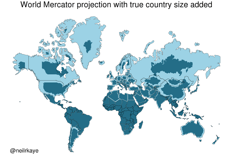
The Mercator map is often criticised saying it gave advantage to the colonists as it shows Europe bigger in size than actual. Greenland, Canada and Russia became the most affected in the distortion.
The Projections
The projection is the systematic way in cartography for flattening the globe surface into a map. The latitude and longitudes are systematically transformed from the spherical surface to the flat surface, this always creates some distortions. Depending upon the use cases the distortions that are to be avoided are chosen. Like mentioned above the Mercator projections preserved the directions and shape, thus sailors preferred it. Though the Mercator projection was used commonly, the creator Gerardus Mercator himself used Sinusoidal projections for many visualisations as it preserves the area. It is the same projection used by the MODIS products too.
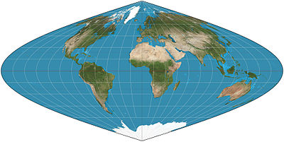
Sinusoidal Projection | Image:Strebe
The projections are done considering the Area, Shape, Direction, Bearing and Distance as they are the properties which the maps need to convey depending on their use case. Although many map projections are simply tracing down the globe’s surface, they involve proper steps in doing so. One needs to select the apt shape for projection - either ellipsoid or sphere, then transform the geographic coordinates to the cartesian coordinates (latitude and longitude to easting and northing).
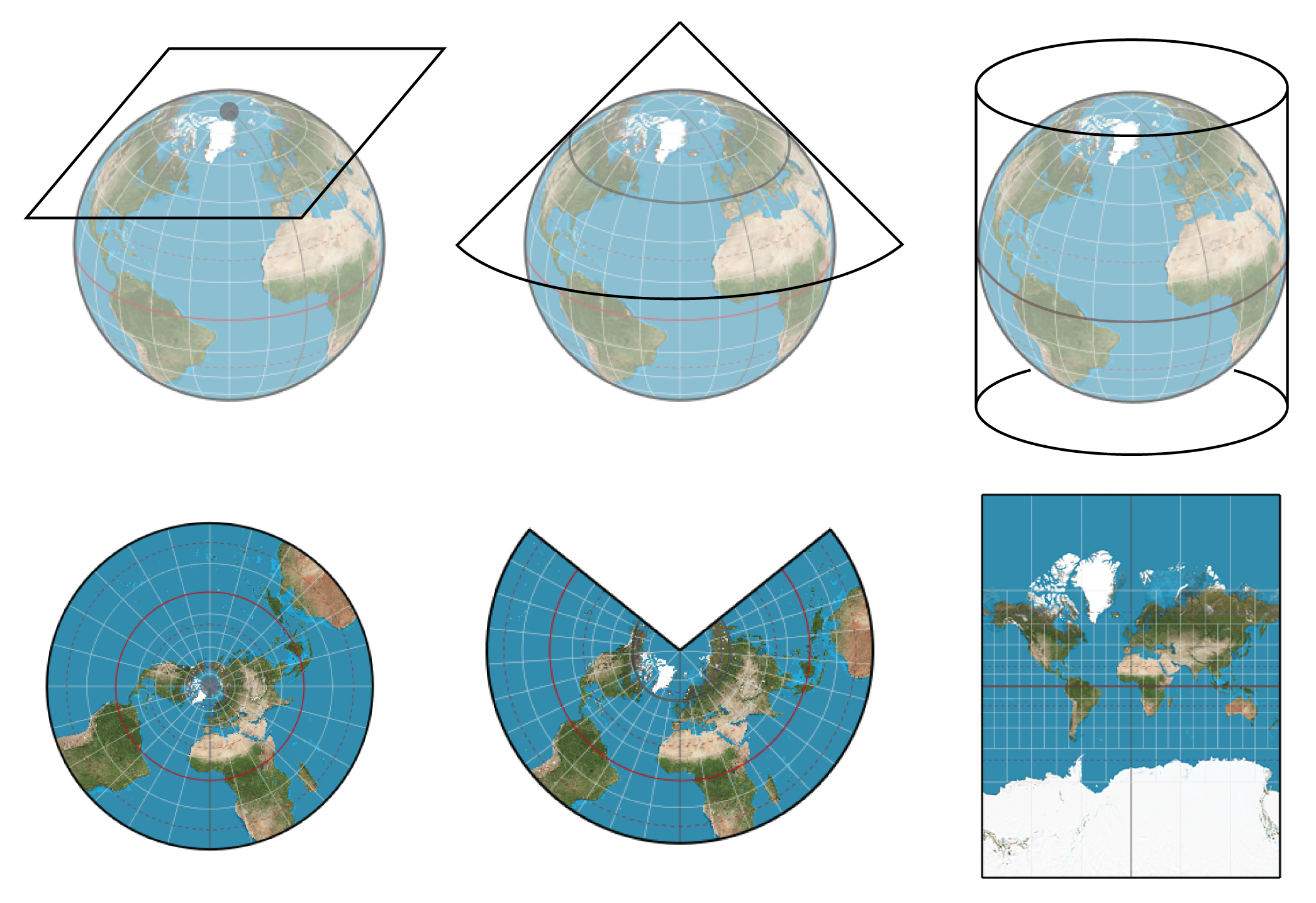
(From left) Azimuthal projection, conical projection and cylindrical projection.
UTM
The UTM (Universal Transverse Mercator) is a modified Mercator projection system developed mainly for making large scale maps (of small areas). As the name indicates it is a series of projections(transverse) not a single one. UTM exercises a series of sixty zones each 6 degree longitude wide. A point in UTM is mentioned as the x,y coordinate of the plane and the zone. UTM is widely used since the base units of the map are in meters and which are easy for computational works such as distance measurement, area calculation etc.
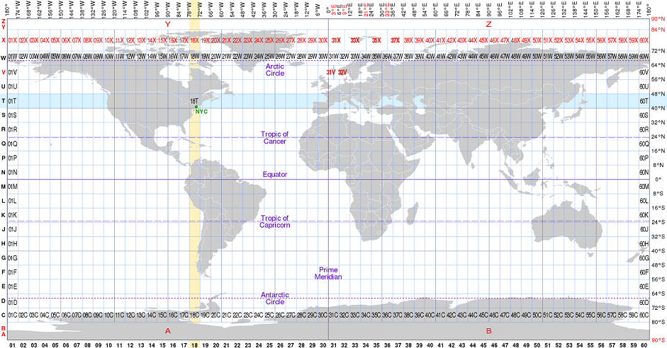
Universal Transverse Mercator zones on an equirectangular world map with major circles of latitude Red labels denote irregular zones. | Image : CMG Lee.
Web Mercator Projection
This is the era of digital interactive maps and most of the digital maps are following the web mercator projection(Spherical Mercator). Google maps followed web mercator and thus subsequently became standard for all main webmap providers like OpenStreetMap, Bing maps, Mapbox etc. The web mercator uses spherical form and geographical coordinates require WGS 84 ellipsoidal datum.
Home page of OpenStreetMap, map displayed in the web mercator projection
The digital maps are highly dynamic with their ability to zoom, and at each zoom level the map and the map information changes. The reason for adopting web mercator projection is that the spherical form is simpler and requires less computational time. In order to optimise the rendering they have adopted the web mercator projection.
The Best Map
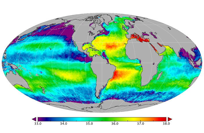
Obviously the next question that comes to everyone’s mind is Which projection is the best? Sea Surface Salinity map. | Image: NASA Salinity
If you see the answer, the projection mathematics does not give any extra mark to any of the maps or projection. Distortions are inevitable in any map. Use case defines which is the best map for it.
For example: The sailors need to navigate hence the direction and shape has to be retained hence the Mercator became the best for the navigational use.
For representing the data having the entire world as location such as the night sky, ocean temperature etc. the Mollweide projection is used as the area is preserved.
Any Comments on the article? Let me know @arkarjun.