Why You May Never Get to Put a Number on It

Published: 14 September, 2026

11 mins(s) read


Series: Platform Engineering: Building, Defending and Becoming It
Posts from "Platform Engineering: Building, Defending and Becoming It" series:
Table of contents:
This is the second in a series, Platform Engineering: Building, Defending and Becoming It*, walking through the learnings from building a geospatial platform, especially where it contradicted the regular theory of product development.
License: This article is licensed under the Creative Commons Attribution-ShareAlike 4.0 International (CC BY-SA 4.0) license.
In part one we saw about a simple rule: a fix doesn’t count until it’s whole, and shipping a system in pieces is more dangerous than shipping nothing at all. This one is about what happens once you’ve actually held that line, and still can’t prove any of it worked.
Say you did it right. You held the line on parity, you didn’t let anyone call a roof with no walls a house, the migration path was deliberate instead of hopeful, and every seam that could have silently contradicted itself got closed before it had the chance to. That’s the harder half of the last piece, and it’s real work. Here’s the part nobody warns you about before you start: doing all of that correctly still doesn’t guarantee you can prove, on any timeline your organisation finds satisfying, that it worked. This part is all about those metrics and proofs.
Your MVP Is Not My MVP
That gap between doing it right and proving it is where the trouble usually starts. The instinct to prove it can show up before the system has actually earned it. Reaching for a usage number, a slide, a trend line moving the right way, is a fine instinct to have this early. But the number only means something once the system has cleared the bar the last piece was about. Build the dashboard before it gets there, and it’s the roof-with-no-walls mistake again. This time it’s whoever’s holding the metric making it, not whoever’s holding the build. There are two different bars hiding under one word, MVP. One is what a builder or maker (can be a PM or an engineer who owns the build) defines internally: whatever slice was enough to start counting something. The other is what a user actually lived with: whatever slice was enough to make them stop reaching for their old workflow. Those two are not automatically the same bar. If you get confused with them, then you end up with a chart worth presenting before you have a system worth using. The rest of this piece assumes you cleared that second bar too, that whatever’s being measured actually earned the right to be measured.
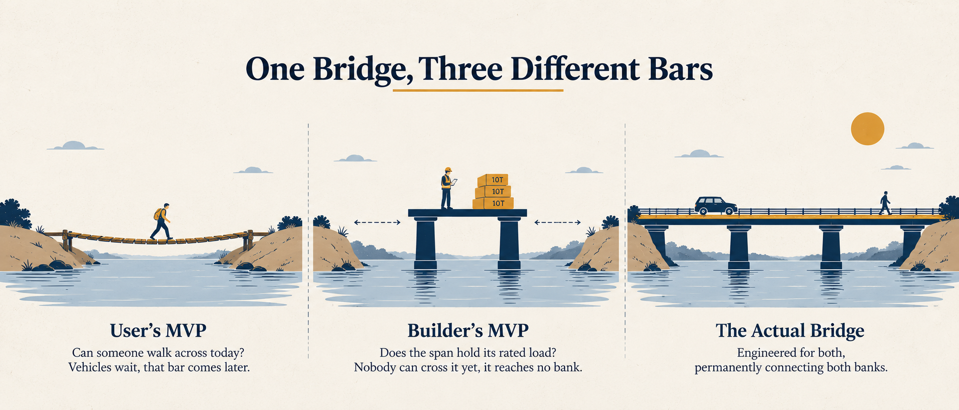
Same bridge, three different bars: the user tests whether they can cross, the builder tests whether the span holds, and neither is the finished bridge.
When the Number Isn’t the Whole Story
Internal platforms rarely get a clean before and after. There’s no market signal, no competitor to benchmark against, and the win is often invisible by design: fewer 3 a.m. fire drills, fewer reconciliation threads in someone’s inbox, a question that used to take a day to answer now taking an hour. None of that shows up cleanly on a slide next quarter. Some of it never will. Some of it just takes months to become visible, even to the people closest to it.
Go back to that supermarket shopper in Part One, this time from the other side of the counter. Some customers already know the store. Others have never set foot in it. Measure adoption of the catalogue across both groups at once, and the veterans drag the number down no matter how good the catalogue actually is. This reads the catalogue as a failure when it isn’t one. Measure new-customer volume after the catalogue launches instead, and you get a better signal, but still an imperfect one; plenty of other things can move that number too. Choosing the right metric matters, and not every metric fits every system, which is exactly why this is hard to get right rather than merely hard to instrument.
YouTube’s own recommendation algorithm tells a longer version of the same story. By February 2017 the platform was celebrating a billion hours of watch time a day, a real number built by years of deliberately optimizing for exactly that metric. It wasn’t gamed. It wasn’t cooked. It was just working. Two years later, in January 2019, YouTube announced it would start reducing recommendations of what it called “borderline content,” videos that skirted its policies without breaking them outright, because that same optimization had been quietly rewarding exactly the kind of content most likely to mislead people, and watch time had never had a column for that. The number had been telling the truth the whole time. It just wasn’t the whole truth.
The same failure mode shows up in a much newer, faster-moving version of the same argument, without any fraud involved either. In February 2024, the Swedish fintech company Klarna announced its AI customer service assistant had handled 2.3 million conversations in its first month, two thirds of all customer service chats, cut average resolution time from 11 minutes to under 2, and reduced repeat inquiries by 25 percent, work the company said was equivalent to 700 full-time agents. Every one of those numbers was real, and every one of them looked exactly like the proof a rollout like this is supposed to produce. By May 2025, Klarna was hiring human agents back. Its CEO, Sebastian Siemiatkowski, told Bloomberg that cost had been “a too predominant evaluation factor” in how the deployment was judged, and that the result was lower quality, adding that investing in human support was “the way of the future” for the company. Nothing about the original numbers was wrong. Speed, volume, and repeat-contact rate all genuinely improved. They just weren’t measuring the one thing that ended up mattering enough to walk part of the rollout back, whether the person on the other end felt like they’d actually been helped.
YouTube and Klarna both had metrics that were honest and still incomplete. There’s a second, uglier way for a metric to fail: someone can make it lie on purpose. Wells Fargo’s cross-sell scandal, exposed in September 2016, is the sharpest example of that. The bank once tracked a “cross-sell ratio,” products per customer, as its measure of relationship depth, and pushed staff hard enough against it that employees ended up opening close to 3.5 million accounts nobody had asked for, just to move the number. The ratio looked excellent right up until regulators added up the fraud behind it, over $3 billion in penalties by the time it was done. Nobody sets out to build that. It’s what happens when a proxy for value gets managed as if it were the value itself, and nobody’s checking whether the two are still pointing the same direction.
The Cop-out Metric
I used to treat the absence of a clean number as a personal failure of measurement, something I should have instrumented better from day one. Fournier and Nowland make a sharper argument that I now think is closer to correct: adoption itself can be a misleading success metric, especially when your users don’t really have a choice about using what you build. Chase a 100% adoption number hard enough and you stop building what people actually want and start building what you’ve decided they should want, then leaning on them to justify not using it. Completion is worse still, they call it the “cop-out metric” that only tracks your own ability to declare victory. Neither one tells you whether the thing you built is actually good.
Internal systems carry an extra difficulty on top of all this. The people using them know the system in and out, so they adapt around its imperfections quietly: a workaround here, a manual double-check there, and the friction that never gets fixed also never gets reported, because nobody thinks to mention a problem they’ve already learned to live with. That’s why feedback loops matter here more than almost anywhere else. It’s also why they’re the first thing that gets skipped when nothing about the problem shows up on a revenue line. Why that keeps happening, and what it actually takes to get platform work resourced when it doesn’t move revenue, is worth its own piece, more on that next time.
No Baseline, Still Real
There’s one more wrinkle worth naming. If your system is measuring something for the first time, there’s no existing benchmark to compare it against, and that can look like a failure of measurement when it’s actually the opposite. The same thing happened to an entire industry, not just one team or one system. Before Forsgren, Humble, and Kim published Accelerate in 2018, there was no shared, evidence-based way for a software team to say whether its delivery process was actually good, just opinion and folklore. Their research, built off tens of thousands of data points, gave the industry four measurable numbers: deployment frequency, lead time, change failure rate, and recovery time, letting teams compare themselves to something real for the first time. The specific numbers weren’t the achievement. The fact that a real benchmark existed at all was, and every team measuring something for the first time is living through their own small version of that same moment, whether anyone notices or not.
There’s a simpler way to see this than an industry-wide benchmark. Kerala’s Perumbalam Bridge in Alappuzha, connecting Perumbalam island to the mainland across Vembanad Lake, is a live version of the same idea. Until March 2026, the only way on or off the island was by boat, the last one leaving before ten at night. A medical emergency after that meant a risky crossing in the dark, not an ambulance. Then a bridge opened, the island’s first ever. Nobody needed a traffic count to know that mattered. An ambulance can reach the island at any hour now. A school bus can drive there at all, something that had never once been possible before. Neither of those is a number. Both are capabilities that didn’t exist a month earlier, and that’s just as real as a chart.

Kerala’s Perumbalam Bridge, opened March 2026: proof of a real capability, not a usage chart. Image: the_explorer (via Great Kerala X handle), Map: OpenStreetMap.
In my own case, I built a STAC catalogue for raster once, where there hadn’t been one before. Before it existed, every downstream pipeline had someone’s file naming convention and storage path hardcoded straight into it, so knowing whether a dataset was even available meant grepping through folders and hoping whoever built that pipeline had written down where things lived. There was no adoption number to chase on day one, because there was nothing before it to measure adoption against. What showed up almost immediately was work that had never been possible before. You could check whether a dataset existed, and where, without touching the pipeline that consumed it or paying the cost of digging through someone’s folder structure to find out. A dashboard could pull from three different sources in one query instead of someone hand-stitching a script to prepare each one first. Observability came along almost as a side effect, once there was finally one place, the catalogue itself, worth watching. None of that is a usage chart. All of it was real, and provable, well before a chart could have existed to prove it.
A Metric Can Hide Improvement
Even where a number does exist, it can hide the improvement instead of showing it. Turnaround time and cost are the usual metrics for an internal delivery system, and they’re both vulnerable to the same problem. New workloads, changed resources, changed requirements, changed quality expectations, all of it pushes in the opposite direction at the same time your fix is pushing forward, and the two forces can cancel each other out on the page. That doesn’t mean your system failed. Picture a racing team that’s finished second for years running one driver, then switches to a rookie who’s never raced before, and the rookie also finishes second. The leaderboard looks unchanged. Nobody watching sees that the rookie’s second place is actually a breakthrough, or that the team now has two drivers capable of finishing on the podium instead of one.
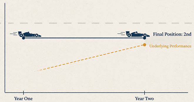
Same leaderboard position, two years apart: the number can hide the exact improvement it was meant to show.
Absence Is Not Failure
So the absence of a clean number doesn’t mean a platform failed. It might mean you’re measuring the wrong thing. It might just mean the result hasn’t had time to show up yet. Either way, you often have to keep building anyway, on the conviction that the standardisation is obviously right even before anyone can prove it on paper. That’s an uncomfortable place to work from. It’s also, as far as I can tell, where almost all of the infrastructure that quietly holds a data organisation together actually gets built.
None of this is the interesting part of the job to talk about at a dinner table. There’s no demo for a catalogue that finally covers everything, no screenshot for a drift check that fired at 2 AM instead of costing a client three weeks. That’s exactly why it stays underbuilt across the industry, and exactly why the teams that do it properly end up quietly ahead of the ones that don’t.
I’ll get into what it takes to actually keep this kind of work resourced next: the case for building something horizontal inside a business that isn’t fundamentally in the business of platforms. For now, if you’ve got your own roof-with-no-walls story, I’d genuinely like to hear it.
Any comments on the article, let me know @arkarjun or @Medium.